RT 4.4.3 Documentation
Charts
RT Charts
RT has a built-in charting feature to allow you to create charts and graphs to visualize ticket data. Charts can be useful for anything from one-off reports (how many tickets did we process last year?) to regular status reports that you then include in shared dashboards that everyone can see.
RT has had charts for a long time, but many significant improvements came in RT 4.2. If you're running a version of RT earlier than 4.2 some options and features described here may not be available.
Enabling Charts
Installing GD
While charts is a core part of RT, you do need to enable it using the --enable-gd option and install the required dependencies when you install RT. If you didn't originally install with this flag, you can enable it by re-running the configure script from the RT distribution (including all previous options passed to it originally) or doing the following in your current install:
In your
RT_SiteConfig.pmset$DisableGDto 0:Set($DisableGD, 0);Run the RT dependency checker:
$ /opt/rt4/sbin/rt-test-dependencies --with-gd --verboseInstall GD libraries
GD is an open source graphics library and it is available as a package for most Linux systems. The package might be called
gd,gd2,libgd2, or something similar. On some systems you will also need additional package required to compile code using the library. The package might be calledgd-devel,gd2-dev, or something similar.Install Perl GD modules:
$ /opt/rt4/sbin/rt-test-dependencies --with-gd --install --verbose
Chart Configuration Options
By default, RT is configured to use the "Droid Sans" font for Unicode support across English, many western european languages, Chinese (Traditional and Simplified), and Japanese. If you prefer to use a different font, you can change the "%ChartFont" option.
There is also an option to use database timezone conversion for PostgreSQL, MySQL, and MariaDB to enable timezone conversion for time-based reports. See docs/customizing/timezones_in_charts.pod for details.
Search for "Chart" entries in RT_Config for more information on these options.
Basic Charting
Charts are based on the set of tickets returned by a search, so every chart starts with a search of your RT tickets. When constructing your search, think about the report you need to generate and try to narrow the results to the set of tickets that will have the information you want.
Basic Ticket Search
As a basic example, assume you want to look at activity in July 2012 for the General queue. First use the Query Builder to build a query with something like:
    Queue = 'General'
    AND Created >= '2012-07-01'
    AND Created <= '2012-07-31'
This search will give you tickets for July because the criteria uses before and after for the dates.
This search shows one of the initial things you'll want to consider, which is the element of ticket metadata you want to use as the basis for time. In the example we're using Created, but depending on what you are reporting on you might want Started, Resolved, or any of the other ticket time values.
When selecting the criteria for the time search, make sure it is appropriate to the report you want to see and be consistent so you are looking at the right set of tickets in the search and the resulting charts and reports.
For this example, we'll say the activity we want to look at is new tickets coming into the queue, and Created works well for that.
Ticket Charts
If we run the search and look at the results, we get the standard RT search results page. From this page we can click on Chart in the submenu on the upper right of the page. This brings us to the Charts page with a default bar chart showing tickets by status in the General queue.
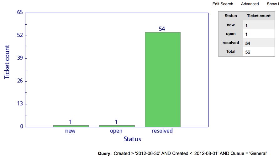
This chart gives us a nice view of tickets by status and the good news is most of the tickets in this time period have been resolved. Under the graph is a "Group by" section and we can see "Status" is selected as the criteria in the first dropdown in the first section. The second dropdown is also Status since status only has one representation.
Now let's assume we want to see who was working on those tickets. You can select Owner from the first 'Group tickets by' dropdown and you'll see the second dropdown now has options to display labels based on RT user entries. Select an option and click 'Update Chart' and now you'll see the tickets displayed by Owner.
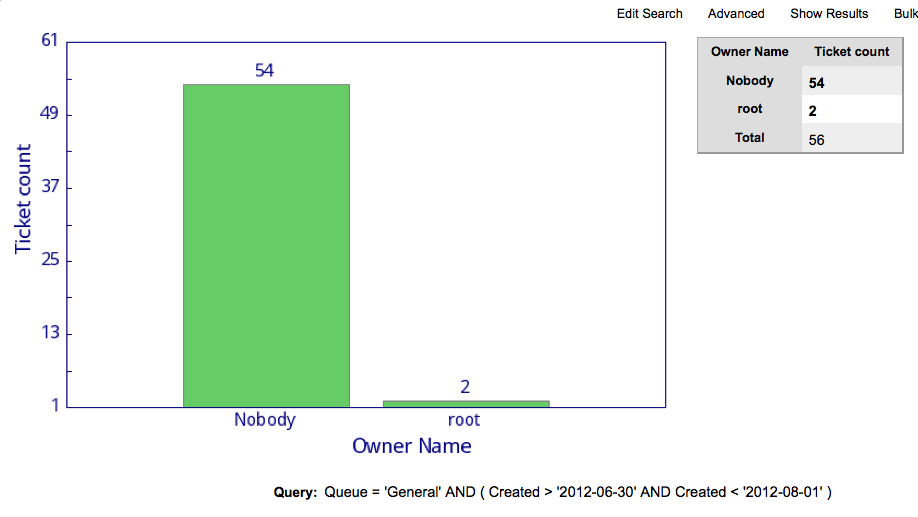
In this case, we can see that although people are resolving tickets, they aren't Taking the tickets and Owner is not getting set. We may want to remind people to take tickets or even create a scrip to set Owner automatically on reply or resolve.
Before we do that, we can use more chart features to find out more about what's going on. The "Group by" portlet allows us to set multiple criteria, so in the second set of dropdowns we'll select LastUpdatedBy and Name and click 'Update Chart'.
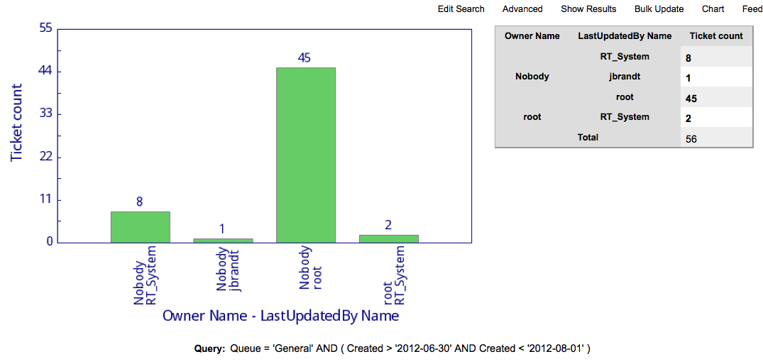
Now we can see that our culprit seems to primarily be the root user, who is getting a bunch of work done but isn't taking tickets. Maybe we just need to remind root to take tickets.
Using Multiple Group Bys
As you can see in the previous example, RT's charts allow you to define multiple criteria for grouping data from your search results. In many cases, grouping multiple levels of criteria can reveal interesting and useful graphs. To give you the greatest flexibility possible, the RT interface allows you to select from nearly all ticket values, but not all combinations of group by criteria will make sense or create a helpful chart. If you select some options and produce a chart that looks jumbled, consider again what you're trying to visualize from the data.
Calculated Values
The Calculate section of the RT charts interface allows you to generate charts with calculated time values. You can select time values used in time tracking (e.g., TimeWorked) and calculated values from the various timestamps on tickets like Created, Resolved, etc. Once you have selected the values or ranges you want to view, you can choose to see an Average, Total, Maximum, Minimum or a summary presenting them all.
Viewing Ticket Response Times
As described above, the Calculate section allows you to pull out durations like how long it took for tickets to be opened, which is the difference between Created and Started. To create a chart with this information, we first create a new search to return all resolved tickets for a select group of queues we're interested in. You could also add some date criteria to narrow the search to a range of time as in the previous example.
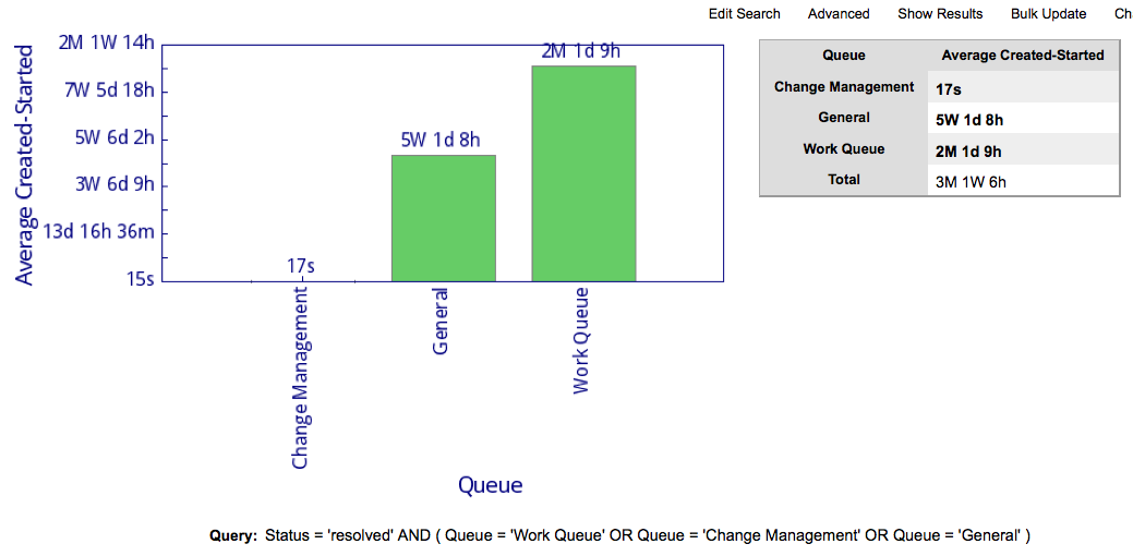
After getting our result set and clicking on Charts, we select Queue from the "Group by" section so we see data grouped by the queues we selected. In the Calculate section we select Created-Started from the first dropdown and the Summary option from the second dropdown and click "Update Chart".
This generates a detailed chart with a bunch of time data for all of the queues we selected in our search. It's a little busy, so we might look at some of the other display options available in the second dropdown. What we're really interested in is the average time from Created to Started, since this will give us a general idea how long it's taking people to initially respond to requests.
The second dropdown in the Calculate section has an option for "Average Created-Started". If we select that and update the chart, we see a nice graph of average time for tickets to be opened across all of the queues we selected.
Now perhaps we also want to see how long tickets stay active. In the Calculate section you can add Started-Resolved to the first "and then" and select "Average Started-Resolved" from the second dropdown. Click "Update Chart" and you've now got a graphical view of how long, on average, tickets are waiting to be opened and how long people are working on them.
If you use RT for time tracking, you can create similar useful charts using TimeEstimated, TimeWorked, and TimeLeft.
Chart Style and Size
Charts default to a bar style, but you can display data as a pie chart by selecting pie in the "Picture" portlet. You can also adjust the width height of the generated chart by entering a size in pixels. These width and height values are saved if you save the chart and are used if you include the chart on a Dashboard as well.
Saving Charts
Much like searches, you can save charts once you get them configured the way you want. The Privacy setting determines who else on the RT system will be able to see your saved charts. Note that this setting applies only to the chart itself and not necessarily the data included which may still be blocked from other users.
To save a chart, select a Privacy setting, give it a Description and click Save. Once saved, you can retrieve the chart later by coming to the chart page and selecting it from the "Load saved search" dropdown and clicking Load.
When you save a chart, it also becomes available to the Dashboard interface. This allows you to go to Home > New Dashboard and create a Dashboard that shows the chart you have created. This can be very useful for charts you want to monitor frequently or create for others.
If you need to change a chart, load it, make your changes, then click Update. Delete deletes the saved chart and will also remove it from all Dashboards that are using it.
← Back to index